Website Design for Small Business That Supports Long-Term Growth
A small business website can either act like a steady salesperson or a quiet liability. I have seen both. One owner spends money on a beautiful launch, then watches the site sit there for three years while leads drift to competitors. Another starts with a modest site, but the structure is smart, the messaging is clear, and every update makes the business easier to find, easier to trust, and easier to buy from. The difference usually is not budget alone. It is whether the site was designed for growth or for appearance.
That distinction matters more than many business owners realize. Plenty of websites look polished on day one. Far fewer continue to serve the business as it adds services, hires staff, enters new markets, invests in search visibility, or tries to improve conversion rates. A site that supports long-term growth does more than present information. It creates momentum.
When people talk about web design, they often focus on color palettes, logo placement, or whether a layout feels modern. Those things matter, but they are the visible layer. Underneath is the real foundation: how quickly the site loads, how clearly it explains value, how easily a visitor can take the next step, how well the pages are organized for search engines, and how simple it is for the business to update the site without calling a developer every time a phone number changes.
For a small business, those decisions are not cosmetic. They affect revenue.
Good design earns its keep
A business website should justify its cost over time. That means it has to do practical work. It should answer the questions prospects ask before they call. It should reduce hesitation. It should help the right people find the business through search. It should make the company look established, even if the team is lean. It should help convert traffic into calls, quote requests, appointments, and sales.
The strongest small business sites usually share one trait: they respect the way real customers behave. People do not read every page in order. They scan. They compare. They get distracted. They open five tabs. They check your reviews, then return to your site looking for confirmation that you are credible and easy to work with. If the site makes them work too hard, they leave.
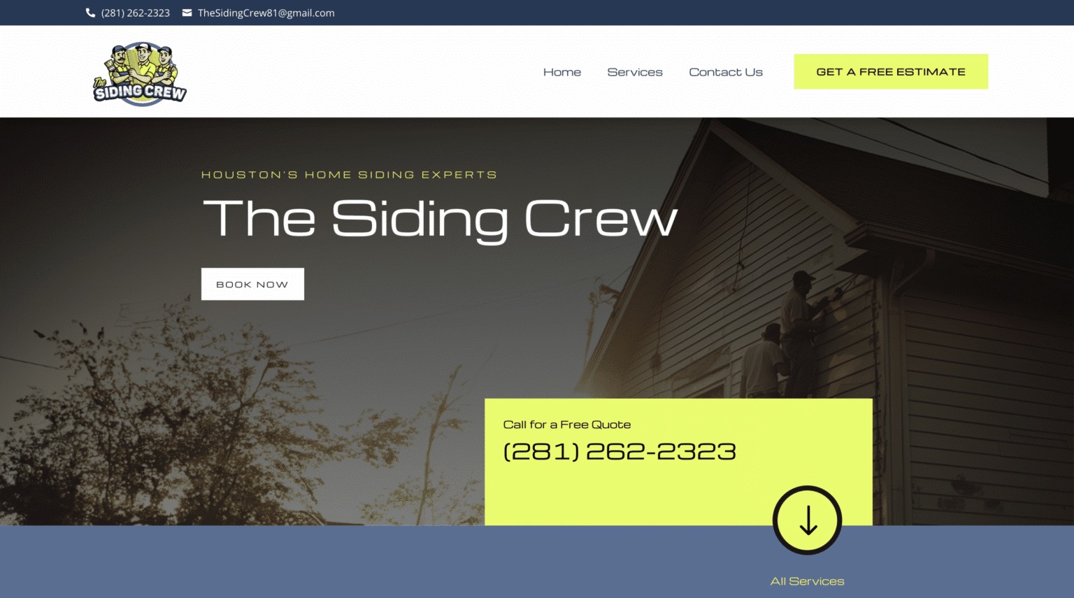
That is where website design for small business differs from design done for a large brand with national recognition. A known brand can get away with more friction because people already trust the name. A local roofer, accountant, med spa, attorney, or contractor does not have that luxury. Every page has to help establish confidence quickly.
I have watched businesses improve lead quality with what looked like small changes from the outside. Sharper service pages. Cleaner navigation. Better before-and-after photography. Fewer generic claims. Stronger calls to action. A mobile layout that did not bury the phone number. Those updates rarely feel dramatic during the design process, but over six months they can change how a business grows.
A website should be built for the next three years, not just next week
One of the most common mistakes in web design is treating the site as a one-time project. Owners think in terms of launch. Growth-minded businesses think in terms of evolution.
A site designed for long-term use should make expansion easier. If your business adds a second location, can the site support that cleanly? If you want to target a new service area, is there a sensible way to add pages without creating confusion or duplicate content? If your service menu becomes more specialized, can your navigation and page structure grow without becoming a mess?
This is where strategy beats trend-chasing. A design that looks current but lacks a sound content structure will start fighting the business within a year or two. You see it when service pages are too vague, when all traffic is forced to the homepage, or when the site architecture gives no room for future search growth. Owners end up paying twice, once for the original build and again for the redesign they now need sooner than expected.
A better approach is to design the site around the business model itself. What services produce the best margins? Which customer types are most valuable? What jobs or appointments require more trust before someone converts? Where does the sales process stall? A website that supports growth reflects those realities instead of just displaying a digital brochure.
The homepage is important, but it is not the whole game
Small business owners tend to fixate on the homepage, and I understand why. It is the page everyone imagines first. But many visitors never begin there, especially once search traffic starts growing. They land on service pages, location pages, blog content, or even an FAQ. If those pages feel neglected, weak, or disconnected from the rest of the brand, the site loses momentum.
The best-performing websites treat every key page as an entry point. A plumbing customer searching for water heater replacement should land on a page that speaks directly to that need. A family law client looking for child custody guidance should not have to hunt through a generic legal services page. Relevance is persuasive. It tells the visitor, quickly, that they are in the right place.
This matters for search visibility as well. Google does not rank a site because the homepage is attractive. It ranks pages that seem useful, specific, and aligned with search intent. Design and content have to work together. A beautiful page with thin copy often loses to a plainer page that answers the user’s question better.
What actually builds trust online
Trust online is cumulative. It forms from dozens of signals, some obvious and some subtle. Professional photography helps. So does a strong logo. But design alone cannot carry credibility if the messaging is vague or the details are sloppy.
Visitors notice when a business sounds generic. They notice when testimonials feel old. They notice when service descriptions are broad enough to apply to any competitor in town. They notice when a contact page lacks substance, or when the only proof of experience is a line that says “we care about our customers.”
Convincing trust signals are specific. Mention years of experience if that context matters. Show the actual process customers can expect. Include real project images instead of stock photos whenever possible. Clarify service areas. Display reviews in a way that supports the story your site is already telling. If your team has licenses, certifications, or notable specializations, present them clearly but without chest-thumping.
One of the simplest trust upgrades I recommend is improving the quality of service page content. Instead of saying a company offers “high-quality solutions tailored to your needs,” explain what the work involves, what common problems customers face, and what makes your approach different. Precision calms uncertainty. Generalities increase it.
Mobile design is no longer a secondary concern
Many small business sites still treat mobile users as an afterthought, even though a large share of local traffic comes from phones. That gap shows up in painful ways. Buttons are too small. Text blocks are too dense. Forms ask for too much. Images push important content too far down the page. Contact information is visible on desktop but hard to find on mobile.
When that happens, the site may still “work” technically, but it underperforms commercially. A mobile visitor is often closer to taking action. They may be standing in a driveway looking for a contractor, sitting in a parking lot comparing clinics, or searching for an emergency service after business hours. If the experience is clumsy, they do not wait around.
Strong mobile design is less about shrinking a desktop layout and more about rethinking priorities. What does this visitor need first? Usually it is reassurance, clarity, and an easy way to contact the business. That means concise messaging, tap-friendly navigation, fast load times, and calls to action placed where people can actually use them.
Speed and simplicity win more business than flashy effects
There is a temptation in web design to impress with motion. Animated transitions, video headers, hover effects, layered interactions. Used carefully, those can add polish. Used excessively, they distract from the reason the site exists.
A small business website should feel modern, but modern does not mean complicated. In practice, the most effective sites tend to be cleaner and more focused than owners expect. Fast pages, readable type, clear sections, and intuitive paths to action outperform visual clutter over and over again.
I have seen owners request elaborate homepage sliders, autoplay videos, and dense interactive elements because they wanted the site to feel “premium.” Then the page loads slowly, the message gets buried, and mobile users struggle. Premium is not what slows people down. Premium is what makes the experience feel effortless.
This becomes especially important when a business starts investing in marketing. Paid traffic is expensive. Organic traffic takes time to build. Every click matters. If the site wastes attention on design tricks instead of helping users move forward, the business pays for that friction again and again.
SEO works better when design and structure are handled early
Search performance is often treated as a separate service that begins after the website is done. That split creates avoidable problems. The smartest path is to make core SEO decisions during the design process, when page structure, navigation, internal linking, and content hierarchy are still taking shape.
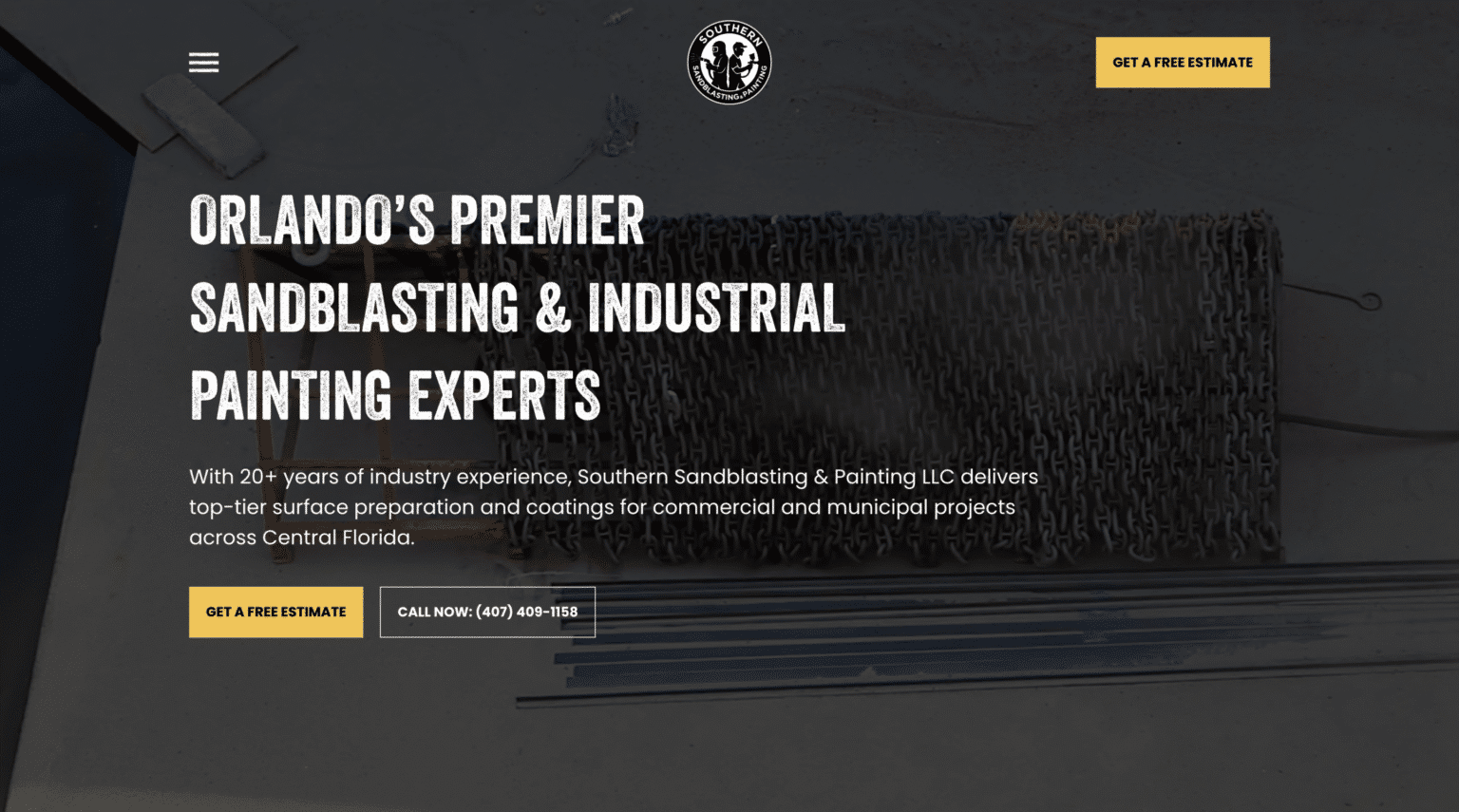
This does not mean stuffing pages with keywords. It means building a site that makes sense to both people and search engines. If you offer five distinct services, each one likely deserves its own page. If you serve multiple cities or neighborhoods, your local strategy needs a plan, not random mentions in footers. If your site has a blog, the topics should reinforce your service authority instead of wandering off into unrelated content.
For businesses targeting local customers, details matter. Title tags, page headings, schema, image optimization, and internal links all play a role, but none of them compensate for a weak site structure. Good SEO often looks boring from the outside because much of it is foundational. That is exactly why it lasts.
This is also where local context can matter. A company looking for web design The Woodlands, for example, may need a site that speaks to a specific service area, local competition, and the expectations of nearby customers. Local businesses do not grow by appealing to everyone. They grow by being unmistakably relevant to the market they serve.
The content problem most small business sites never solve
A lot of websites sound like they were written by committee, or worse, by no one in particular. The language is polished but empty. Every claim is safe. Every service page says some version of “we are committed to excellence.” The result is a site that looks acceptable and says almost nothing memorable.
That is a problem because small businesses usually do have real differentiators. They know which jobs they take and which they avoid. They know where projects tend to go wrong. They know what customers misunderstand before buying. They know why one service option costs more than another. They know what kind of client relationship leads to the best outcomes.
That knowledge should shape the writing.
Content becomes persuasive when it reflects lived experience. A remodeling company can explain how project timelines shift when materials are backordered. A bookkeeping firm can point out the reporting gaps that create tax-season stress. A dentist can explain how patients who delay treatment often end up with more invasive procedures later. Those are not marketing clichés. They are useful truths. They help a prospect trust that the business knows what it is doing.
Good web design makes room for that clarity. It does not trap the business inside vague, tiny content blocks because the layout looked cleaner in the mockup.
Signs a website is holding a business back
Sometimes owners sense that their site is underperforming, but they cannot pinpoint why. Usually the issue is not a single flaw. It is the accumulation of small weaknesses that make the site harder to trust, harder to find, or harder to use.
Here are a few signs that a redesign is overdue:
- The site looks acceptable, but it rarely generates qualified leads without heavy referral traffic.
- Service pages are thin, repetitive, or too broad to rank well or convert confidently.
- Updating content requires too much technical help, so the site stays stale.
- Mobile visitors bounce quickly or struggle to complete forms and contact actions.
- The business has changed, but the website still reflects an older version of the company.
When two or three of these show up together, the problem usually runs deeper than surface design. The site is no longer aligned with the business.
Design decisions that pay off over time
Long-term website design for small business growth does not depend on chasing every design trend. It comes from choices that stay useful as the business evolves. Some of the strongest returns come from surprisingly unglamorous improvements.
Clear navigation pays off because customers find what they need faster and search engines better understand the site. Strong service pages pay off because they support both conversions and rankings. A flexible content management system pays off because the business can keep the site current. Better photography pays off because trust rises immediately. Conversion tracking pays off because marketing decisions become less guesswork and more evidence.
There is also a staffing reality here. Small businesses are busy. The owner is not going to rewrite the site every month. The office manager should not need a developer to change office hours. A growth-minded website respects operational limits. It makes updates manageable.
That point gets overlooked in many web design projects. Agencies often focus on the launch presentation, not the maintenance reality. But a site that no one can comfortably update starts aging the moment it goes live.
The cheapest option often becomes the most expensive
I understand why budget matters. Small businesses do not have unlimited marketing funds, and not every company needs a custom build with all the bells and whistles. But there is a difference between being cost-conscious and being penny-wise in the wrong place.
The cheapest web design option often saves money only at the beginning. Later, the owner discovers that the template is rigid, the pages are thin, the site is slow, the SEO foundation is weak, and meaningful changes are hard to implement. Then comes the second project, sometimes within a year.
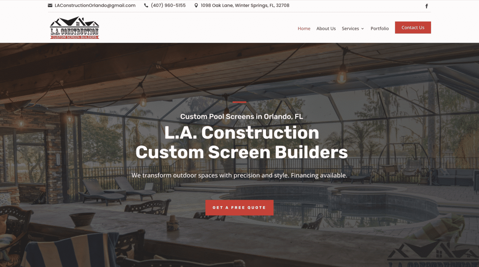
A better question is not “What is the lowest price for a website?” It is “What kind of website will still support this business after we add services, improve our marketing, and try to grow?” That question leads to more disciplined decisions.
Sometimes the right answer is a lean first version with room to expand. Sometimes it is a more comprehensive build because the business is already established and ready to compete aggressively. Both can be smart. What is rarely smart is paying for a site that looks fine in screenshots but fails under real business pressure.
What to look for in a web design partner
A good designer or agency should care about more than style preferences. They should ask how leads come in now, which services matter most, what objections customers have, what marketing channels you use, and how the business expects to grow. If those questions never come up, the project may be headed toward decoration rather than strategy.
The best partners also push back when necessary. They explain why a trendy feature may hurt speed. They recommend simplifying choices when the navigation is getting crowded. They help owners prioritize what matters most instead of approving every idea for the sake of agreement. That kind of judgment is worth paying for.
If you are hiring for website design for small business, look for a team that can connect design decisions to business outcomes. Not every beautiful portfolio translates into strong performance. Ask how they think about conversions, local search, content structure, mobile behavior, and future scalability. Those answers reveal far more than a homepage mockup.
Growth is easier when the website stops fighting the business
A strong website does not guarantee growth on its own. A weak offer, poor service, or bad follow-up can still drag results down. But when the business is solid, the website should amplify that strength, not mute it.
That is what good web design really does. It clarifies value. It supports search visibility. It creates trust faster. It removes friction. It gives a small business a more credible presence than size alone might suggest. Most importantly, it keeps doing that work as the company changes.
That is the standard worth aiming for. Not a website that simply launches, but one that keeps earning its place as the business grows.
Scalable Websites
Website design for contractors and small businesses
Based in Montgomery, TX, serving Montgomery County and greater Houston
Phone: (832) 979-2478
Website: scalablewebsites.com
Hours: Monday to Friday, 8 AM to 5 PM
Scalable Websites builds and manages mobile-first websites for contractors and small businesses on simple monthly plans, with hosting, security and unlimited updates included. Find us on Google.